Today
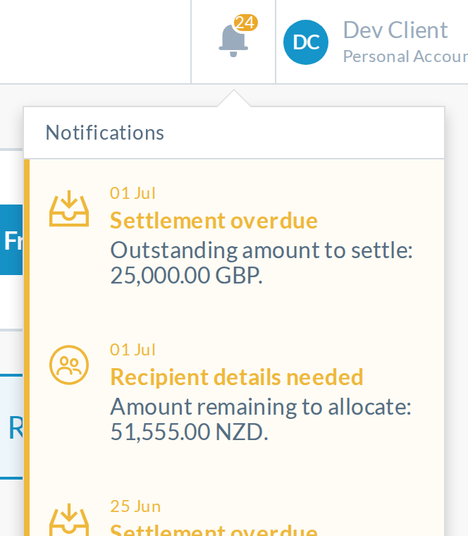
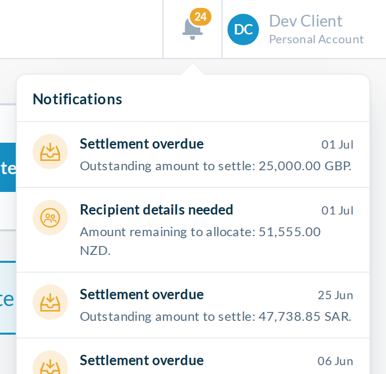
Every action row is cream with amber text.
- Amber titles on cream are hard to read
- 16px text wraps most amounts onto a second line
- Each category uses a different treatment
CurrencyTransfer header, round 2
Every image is a screenshot of the real dev app, logged in as a client with 24 outstanding actions. Click any screenshot to see it full size.
Grows with the count, caps at 99+, and stays clear of the divider.
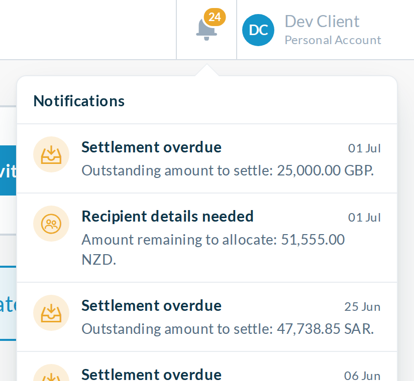
The same calm rows as A, with text close to today's size. It reads best on phones.
Reply to Stevan with your picks and any tweaks, for example Badge A, tray A+
.
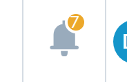
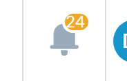
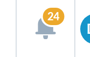
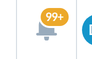
Today the badge is a fixed 16px circle with a 2px border, which leaves 12px for the digits. Both options switch to a pill that grows with the count and shows 99+ above 99. The pill is centred on the bell's right shoulder, so wide counts grow in both directions. Single digits sit exactly where they do today.


 128 shows as 99+
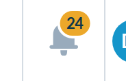
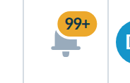 128 shows as 99+
Shown at 150%. Measured in the browser, the gap between the pill's white ring and the divider is 10px at 7, 8px at 24 and 5px at 99+. The first version overlapped the divider by 2px at 99+. The mobile drawer and sidebar approval counters are also white on amber, so A keeps every counter consistent. B is easier to read, and is better done for all counters in its own PR.
The badge counts outstanding actions, and the tray lists those first, so a client with overdue settlements sees a wall of amber. All four options share the fixes below and differ in how each row shows its category.
Every action row is cream with amber text.
A with today's text size: 15px titles, 14px messages, 380px wide.
The same rows with smaller text: 14px titles, 13px messages.
Closest to today: thin rail on action rows, date above the title.
Small inline icons, tighter rows, date on the right.
No option changes the typeface. Chromium reports that every line in today's tray and in every option is drawn in Lato, the web font the app already loads. What changes is size, weight and colour. These crops are shown at true size, not scaled down.
Every option at three screen widths, opened the way a person on that device would. Tablets use the bell and get the dropdown. Phones hide the bell, so the tray opens from the menu as a full-screen sheet.
The dropdown fits with room to spare and the caret stays on the bell. One existing problem at this width: the header search box extends under the bell, so clicking the bell's left half focuses search instead of opening the tray. That is PR 3 below.
Below 768px the row component stacks its parts in a column, a layout built for the dashboard cards. In the tray the new styles keep each row full width, so the date stays on the right.
Today's sheet has a pale 60px X, a 24px centred title with a 40px gap above it, and amounts that wrap onto two lines. Every option replaces that with an 18px heading bar and a 44px close button.
notification-anchor.component.scss, centred on the bell's shoulder, replacing the two-digits special case99+ cap in notification-anchor.component.htmlnotification-list.component.scss and notification-item.component.scss, scoped to the traynotification-item.component.htmlAlso spotted, not part of these PRs: the header draws two stacked copies of itself, so the bell fetches its count twice, and the mobile drawer counter is a fixed 24px circle that will overflow at three digits.