Today
Every action row is cream with amber text.
- Amber titles on cream are hard to read
- 16px text wraps most amounts onto a second line
- Each category uses a different treatment: amber fill, green fill, blue titles
CurrencyTransfer header
Two small PRs for Deyan: make the count badge fit two and three digits, and calm the tray down. Every image is a screenshot of the real dev app, logged in as a client with 24 outstanding actions. Click any tray to see it full size.
Fits any count, caps at 99+, and matches the other counters in the app.
The cleanest of the three. Category colour moves into a small icon chip, so 24 overdue items no longer turn the whole tray amber.
Reply to Stevan with your picks and any tweaks, for example Badge A, tray B, keep the date above the title
.
Today the badge is a fixed 16px circle with a 2px border, which leaves 12px for the digits. Anything above 9 spills out, and three digits are unreadable. Both options switch to a pill that grows with the count and shows 99+ above 99.





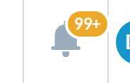 128 shows as 99+
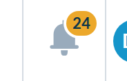
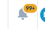 128 shows as 99+
Shown at 150%. The mobile drawer and sidebar approval counters are also white on amber, so A keeps every counter consistent. B is easier to read. If you prefer it, it is better done for all counters in its own PR.
The badge counts outstanding actions, and the tray lists those first. A client with overdue settlements sees a wall of amber: cream rows, amber titles, a heavy amber rail and 16px text throughout. All three options share the fixes below and differ in how each row shows its category.
Every action row is cream with amber text.
Category colour sits in a tinted icon chip. Date on the right.
Closest to today: thin rail on action rows, date above the title.
Small inline icons, tighter rows, date on the right.
notification-anchor.component.scss, replacing the two-digits special case99+ cap in notification-anchor.component.htmlnotification-list.component.scss and notification-item.component.scss, scoped to the traynotification-item.component.htmlSpotted along the way, not part of these PRs: the header draws two stacked copies of the bell and both fetch the count, and the mobile drawer counter is a fixed 24px circle that will overflow at three digits too.